
From Browsing to Buying: E-commerce Website Design Tips for High Conversion
E-commerce Website Design Tips. In the hyper-competitive world of online retail, your website is more than just a digital storefront; it is your most influential salesperson. With global e-commerce sales expected to reach new heights this year, simply “having a website” is no longer enough. To succeed, your site must be engineered for Conversion Rate Optimization (CRO).
A high-converting e-commerce site blends aesthetics with psychological triggers, seamless navigation, and technical precision. Whether you are launching a new brand or auditing an existing one, these design tips will help you turn casual browsers into loyal customers.
1. Master the “Above the Fold” Real Estate(E-commerce Website Design Tips)
The “Above the Fold” area—the part of the screen visible without scrolling—is the most critical part of your homepage. You have roughly 50 milliseconds to make a first impression.
The Power of the Unique Value Proposition (UVP)
Your UVP should clearly state what you sell and why the customer should care.
- Design Tip: Use a bold H1 header that solves a problem. Instead of “We Sell Eco-Friendly Shoes,” try “Walk Comfortably in the World’s Most Sustainable Sneakers.”
- Actionable Step: Place a single, high-contrast Call to Action (CTA) button (e.g., “Shop Now” or “Get the Deal”) directly under your UVP.
Use Visual Cues
Directional cues, such as a model looking toward a button or an arrow pointing to a promotion, naturally guide the user’s eye to where you want them to click.
2. Frictionless Navigation and Search
If a customer can’t find a product within three clicks, they are likely to leave. Efficient navigation is the backbone of User Experience (UX).
Implement Faceted Search
For stores with large inventories, standard categories aren’t enough. Use Faceted Search to allow users to filter by:
- Price range
- Size and color
- Material
- Customer rating
- Availability
The “Thumb-Friendly” Mobile Menu
With over 60% of e-commerce traffic coming from mobile devices, your navigation must be easy to use with one hand. Use a sticky “bottom navigation bar” for essential links like the Cart, Search, and Account.
3. High-Performance Product Pages
The product page is where the actual “buying” decision happens. It needs to provide all the information of an in-person retail experience.
Visual Storytelling with Media
Static images are the bare minimum. To increase conversions:
- 360-Degree Views: Let users see every angle.
- User-Generated Content (UGC): Display photos of real customers using the product. This increases trust by 20% or more.
- Video Demonstrations: Show the product in motion to reduce perceived risk.
Clarity in Pricing and Shipping
Hidden costs are the #1 reason for cart abandonment.
- Actionable Tip: Display shipping costs, delivery estimates, and “Buy Now, Pay Later” (BNPL) options directly on the product page, not just at checkout.
4. The Psychology of Trust and Social Proof
Online shoppers are inherently skeptical. Your design must actively work to build credibility.
Strategically Placed Trust Badges
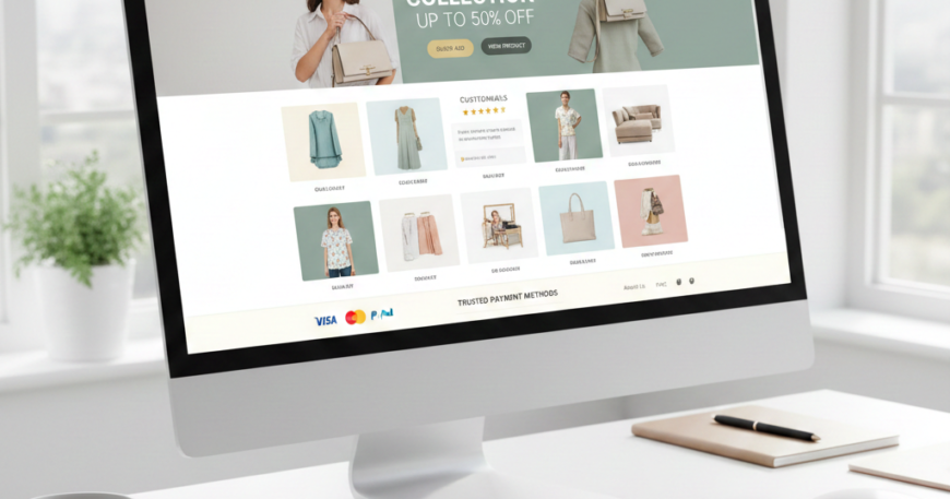
Include icons for secure payments (Visa, Mastercard, PayPal) and security certifications (SSL).
- Pro Tip: Place these badges near the “Add to Cart” button and on the final checkout page to alleviate “buyer’s remorse” or security anxiety.
Leverage the “Bandwagon Effect”
Show real-time social proof to create a sense of urgency and popularity.
- Live Notifications: “5 people bought this in the last hour.”
- Review Highlights: Don’t just bury reviews at the bottom; pull a “top-rated” snippet and place it near the product title.
5. Streamlining the Checkout Process
The transition from the cart to the “Thank You” page should be as fast as possible. Every additional form field increases the Cart Abandonment Rate.
Enable Guest Checkout
Never force a user to create an account before buying. This is a major conversion killer. Offer a “Guest Checkout” option and suggest account creation after the purchase is complete.
Progress Indicators
If your checkout has multiple steps (Shipping > Billing > Review), use a Progress Bar. Users are more likely to complete a task if they know exactly how much is left to do.
One-Click Payments
In 2024 and beyond, digital wallets are king. Integrate Apple Pay, Google Pay, and Shop Pay. These allow users to bypass forms entirely, using biometric data to complete a purchase in seconds.
6. Using “Scarcity and Urgency” (Ethically)
Psychological triggers can significantly nudge a hesitant buyer. However, they must be used honestly to maintain brand integrity.
- Low Stock Indicators: “Only 3 left in stock—order soon!”
- Countdown Timers: Use these for flash sales or “Order within the next 2 hours for next-day delivery.”
- Design Tip: Use a contrasting color (like red or orange) for these alerts to make them pop against your standard brand palette.
7. Optimizing for Mobile Conversion (m-Commerce)
Mobile conversion rates typically lag behind desktop. To bridge this gap, your mobile design must be flawless.
- Avoid Pop-ups: Intrusive interstitials are frustrating on small screens and can lead to SEO penalties. Use subtle “top banners” instead.
- Auto-Fill Capabilities: Ensure your forms are coded to allow browsers to auto-fill addresses and credit card info.
- Micro-Interactions: Use haptic feedback or small animations when a user adds an item to the cart to confirm the action was successful.
8. Data-Driven Design: A/B Testing
No design is perfect on day one. High-converting websites are the result of constant testing.
- What to Test:
- CTA Color: Does a “Green” or “Orange” button get more clicks?
- Product Layout: Does a list view or a grid view perform better?
- Copywriting: Does “Add to Bag” convert better than “Buy Now”?
- The Metric to Watch: Your Average Order Value (AOV) and Customer Acquisition Cost (CAC).