
Precision and Fluidity: The Guide to Responsive Custom Website Development
In the current digital era, the diversity of hardware used to access the internet is staggering. A single user might start their morning by checking a website on a smartwatch, browse it further on a smartphone during their commute, and finally complete a purchase on an ultra-wide desktop monitor at the office. This multi-device journey has made “responsiveness” more than just a design feature—it is a fundamental requirement for business survival.
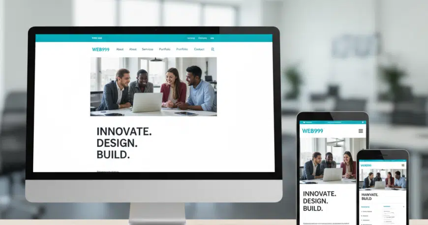
Responsive custom website development is the art and science of building a digital experience that adapts seamlessly to any screen size, orientation, and platform. Unlike template-based responsive designs, which often rely on generic “stacking” of elements, custom responsive development allows for a tailored approach where every pixel is optimized for the specific context of the user.
In this comprehensive guide, we explore the core pillars, strategic advantages, and technical best practices of building a truly responsive custom website.
Why “Custom” is the Gold Standard for Responsive Custom Website Development
While many off-the-shelf templates claim to be “responsive,” they often achieve this by using heavy, bloated code that hides or moves elements in a predictable, non-optimized way. Custom development offers a superior alternative.
- Pixel-Perfect Control: Custom development allows you to define exactly how elements behave at every Breakpoint. You can change font sizes, hide non-essential mobile content, or rearrange navigation specifically for touch interfaces.
- Performance Optimization: Templates often load all assets for all devices, even if they aren’t shown. A custom site uses Conditional Loading, ensuring that a mobile user isn’t wasting data on high-resolution images intended for 4K monitors.
- Lean Codebase: By writing custom CSS and HTML, developers eliminate “code bloat,” which leads to faster rendering times—a critical factor for both User Experience (UX) and Search Engine Optimization (SEO).
The Three Pillars of Responsive Design
To understand responsive custom development, one must understand the three technical foundations that make a site fluid.
A. Fluid Grids for Responsive Custom Website Development
Traditional web design used fixed-width layouts (e.g., 960 pixels). Modern responsive design uses Fluid Grids based on percentages rather than pixels.
- Concept: If a sidebar takes up 25% of the screen, it will always take up 25%, whether the screen is 400 pixels wide or 2000 pixels wide.
B. Flexible Images and Media
Images must be prevented from “breaking” the layout if they are larger than their containing element.
- Implementation: Developers use CSS properties like
max-width: 100%andheight: autoto ensure that images scale down proportionally as the viewport shrinks.
C. CSS Media Queries
This is the “brain” of responsive design. Media queries allow the website to “ask” the device about its characteristics (width, height, resolution, and orientation).
- The Result: The site can serve different styles based on the answer. For example: “If the screen is less than 768 pixels wide, change the horizontal menu into a Hamburger Menu.”
The “Mobile-First” Philosophy
In custom development, the most effective strategy is Mobile-First Design. Instead of designing a complex desktop site and trying to “shrink” it, developers start with the smallest screen and build upward.
- Prioritization: Mobile-first forces you to prioritize your most important content and actions. If it doesn’t fit on a phone, is it really necessary?
- Touch Targets: Custom development ensures that buttons and links are large enough for fingers (minimum 44×44 pixels) rather than just mouse clicks.
- Google’s Perspective: Since Google primarily uses Mobile-First Indexing, a site designed with this philosophy is far more likely to rank high in search results.
Enhancing UX Through Device-Specific Interactions
True responsiveness goes beyond just “fitting the screen.” It’s about how the user interacts with the site.
- Gesture Support: Custom sites can be built to support swipes, pinches, and long-presses on mobile, while maintaining standard hover states and clicks for desktop users.
- Typographical Scalability: Using relative units like REM or EM instead of PX allows the text to scale naturally, ensuring readability for users who may have adjusted their system-level font settings.
- Adaptive Content: Sometimes, a custom site will serve different content altogether. A mobile user might see a prominent “Click to Call” button, while a desktop user sees a comprehensive “Contact Form.”
SEO and the Performance Connection
Responsiveness is a significant factor in how search engines evaluate your site’s quality. Google’s Core Web Vitals are specifically designed to measure user experience on mobile devices.
- LCP (Largest Contentful Paint): Measures how fast the main content loads. A custom-coded responsive site optimizes this by serving properly sized images.
- CLS (Cumulative Layout Shift): Measures visual stability. Have you ever tried to click a button only for the page to move at the last second? Custom development prevents this by reserving space for elements as they load.
- One URL for All Devices: Unlike “m.dot” sites (separate mobile versions), a single responsive URL simplifies your SEO strategy, as all “authority” and backlinks are concentrated on one domain.
Testing: Ensuring Consistency Across the Ecosystem
A critical phase of responsive custom development is rigorous testing. Because you aren’t using a pre-tested template, you must ensure the code holds up across various environments.
- Browser Compatibility: Testing across Chrome, Safari, Firefox, and Edge.
- Device Lab Testing: Checking the site on actual hardware (iOS vs. Android) to see how different operating systems render the code.
- Network Speed Simulation: Using developer tools to see how the site performs on a 3G connection versus high-speed Wi-Fi.
Actionable Best Practices for Your Project
If you are embarking on a responsive custom development journey, follow this Success Checklist:
- Use Scalable Vector Graphics (SVG): SVGs are mathematical formulas, not pixels. They look perfectly sharp on any screen size and have a tiny file size.
- Implement Lazy Loading: This ensures that images only load when they are about to enter the Viewport, significantly increasing initial page speed.
- Avoid Hover-Only Interactions: Ensure that any information revealed by a “hover” on desktop is accessible via a “tap” on mobile.
- Optimize for Orientation: Ensure your layout doesn’t break when a user rotates their phone from portrait to landscape mode.
The Business Impact of Responsive Custom Sites
The ROI of a responsive custom site is found in the data. Studies consistently show that:
- Reduced Bounce Rates: Users stay longer when a site is easy to navigate on their preferred device.
- Higher Conversion Rates: A seamless, frustration-free checkout process on mobile leads to more completed sales.
- Lower Maintenance Costs: Managing one responsive site is significantly cheaper than managing separate desktop and mobile apps.