
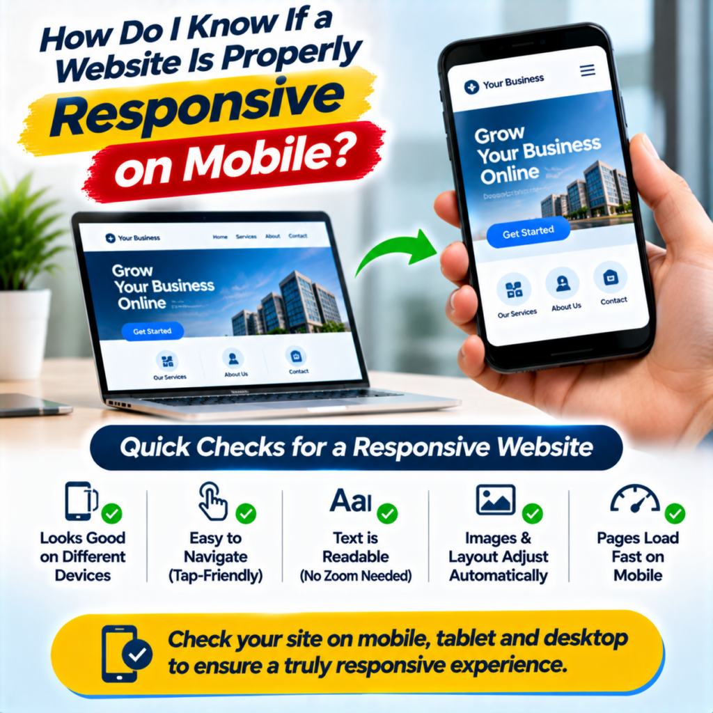
Open your business website on your smartphone and try to contact your company. Can you find the phone number easily? Does the menu open properly? Can you complete the enquiry form without zooming in?
If any of these actions feels difficult, your website may have a responsive design problem.
A website can look attractive on a desktop computer but still create a poor experience on smaller screens. This can affect how visitors explore your services and contact your business.
If you are planning to invest in responsive website design in Ahmedabad, checking mobile performance should be one of your first priorities.
Here are practical ways to test whether your website works properly on smartphones and what you should fix before launching it.
What Does Responsive Website Design Actually Mean?
Responsive website design allows a website to adjust its layout according to the screen size of the device being used.
A desktop screen has more available space than a smartphone. Therefore, website elements need to rearrange themselves to fit smaller screens.
For example, a desktop website may display five navigation links horizontally. On mobile, those links can appear inside a menu icon.
Similarly, a row of three service cards may become a vertical layout on a smartphone.
A properly responsive website should provide a consistent browsing experience across mobile phones, tablets and desktop computers.
It should not force visitors to zoom in, scroll horizontally or struggle with buttons.
7 Ways to Check Whether Your Website Is Mobile-Friendly
You do not need advanced technical knowledge to perform an initial mobile test. Open your website on a real smartphone and try these checks.
1. Check Whether the Website Menu Works Properly
Start with the navigation menu.
On a smartphone, desktop navigation links usually change into a compact menu icon. Tap the icon and check whether the menu opens correctly.
Look for these problems:
- Menu items overlap each other.
- Navigation links are difficult to tap.
- The menu covers important content.
- Visitors cannot easily close the menu.
- Some website pages are missing from navigation.
Your visitors should be able to move between important pages without confusion.
2. Check Whether Text Is Easy to Read
Small text can make a mobile website frustrating to use.
Open your homepage and read the main heading, paragraph text and service descriptions.
You should not need to zoom in to understand the content.
Check whether the text fits inside the screen, headings break naturally and paragraphs have enough spacing.
Also check the contrast between text and background colours.
Readable content helps visitors understand your business without unnecessary effort.
3. Test Buttons and Tap Targets
A button that works perfectly with a computer mouse may be difficult to use with a finger.
Test your website’s main buttons on a smartphone.
Pay special attention to:
- Call Now buttons.
- WhatsApp enquiry buttons.
- Contact form submission buttons.
- Navigation links.
- Product and service buttons.
Make sure buttons have enough space around them. Avoid placing several clickable elements too close together.
Visitors should be able to tap the correct button without accidentally selecting something else.
4. Complete an Enquiry Form on Your Phone
This is one of the most useful tests for a business website.
Open your contact page and try submitting an enquiry using your smartphone.
Check whether the form fields fit properly and the keyboard displays the correct input type.
For example, a phone number field should support numeric input where appropriate.
Also check whether required fields show clear instructions and whether a successful submission displays a confirmation message.
A form that looks good but fails during submission can prevent potential customers from contacting your business.
5. Check Whether Images Fit the Screen
Large desktop images can create problems when displayed on smaller screens.
Some images may become stretched, cropped incorrectly or extend beyond the screen width.
Open different pages and check product images, banners, portfolio photographs and service graphics.
A responsive website should adjust images according to the available screen space.
Images should maintain suitable proportions and should not push important content outside the mobile layout.
6. Check for Horizontal Scrolling
Try scrolling through your website from left to right.
If the page moves horizontally without a clear reason, some elements may be wider than the available screen.
Common causes include oversized images, fixed-width sections, large tables and poorly configured design elements.
Visitors should normally be able to read the page using vertical scrolling.
Fixing horizontal overflow can make the mobile browsing experience much more comfortable.
7. Check Website Loading Speed
A responsive layout is only one part of mobile performance.
Your website should also load efficiently, especially when visitors use mobile internet connections.
Large images, unnecessary scripts and poorly configured plugins can affect loading speed.
You can use Google’s PageSpeed Insights to test your website and review its mobile performance recommendations.
Pay attention to Core Web Vitals, including Largest Contentful Paint (LCP), Interaction to Next Paint (INP) and Cumulative Layout Shift (CLS).
These measurements help you understand loading performance, interaction responsiveness and visual stability.
Why Does Responsive Website Design Matter for Ahmedabad Businesses?
Customers often use smartphones to search for local services, compare companies and find contact information.
Imagine someone searching for an interior designer, real estate consultant or digital marketing agency in Ahmedabad.
They visit your website and find that the service menu does not work properly. The contact form is difficult to complete and the phone number is hidden.
They may leave without contacting your business.
Responsive website design helps businesses present their services clearly across different devices.
For local businesses, a mobile-friendly website can support:
- Easier access to business contact details.
- Better browsing of products and services.
- Convenient WhatsApp and phone enquiries.
- Improved readability on smaller screens.
- A more consistent brand presentation.
Mobile responsiveness does not guarantee higher Google rankings or more enquiries by itself. However, it supports a better user experience and helps visitors interact with your website.
Common Mobile Website Design Mistakes to Avoid
Even professionally designed websites can have mobile usability problems.
Watch out for these common mistakes.
Oversized banners: Large desktop banners may occupy too much space on mobile screens.
Tiny navigation links: Visitors may struggle to select menu items with their fingers.
Too many pop-ups: Full-screen pop-ups can cover important content and interrupt browsing.
Poorly arranged forms: Form fields may overlap or become difficult to complete.
Unoptimised images: Large image files can increase loading times.
Fixed-width layouts: Some sections may extend beyond the smartphone screen.
Testing these elements before launch can help identify problems early.
How Web999 Can Help With Responsive Website Design in Ahmedabad
If your current website does not work properly on mobile devices, or you are planning a new business website, Web999 offers website design and development services in Ahmedabad.
The team works on business websites, WordPress websites, e-commerce platforms and landing pages.
Depending on your project requirements, you can discuss:
- Responsive website layouts for different screen sizes.
- Mobile-friendly navigation and page structures.
- Contact forms and WhatsApp integration.
- Website redesign and layout improvements.
- Image optimisation and performance improvements.
- Basic on-page SEO setup.
If you already have a website, discuss the problems you have noticed during mobile browsing.
You can also explain which features your customers use most often. This helps identify which pages and functions need attention first.
Visit https://www.web999.in/ to explore website design and development services.
Contact the Web999 team to discuss your requirements and understand the next steps for your website project.
Final Thoughts
A website should work just as comfortably on a smartphone as it does on a desktop computer.
Before approving a website design, test its navigation, text readability, buttons, enquiry forms and images on a real mobile device.
Check loading performance and make sure visitors can access important business information without difficulty.
If your existing website has mobile usability problems, consider reviewing its layout and development structure.
Looking for responsive website design in Ahmedabad? Contact Web999 to discuss your website requirements and find out what should be improved first.
Frequently Asked Questions
1. How do I know if my website is properly responsive?
Open your website on a real smartphone. Test the navigation menu, text readability, buttons, enquiry forms and images. Check whether the page fits the screen without unwanted horizontal scrolling.
2. What is the difference between a mobile-friendly and responsive website?
A mobile-friendly website provides a usable experience on smartphones. Responsive design specifically allows the layout and elements to adjust automatically to different screen sizes.
3. How can I test my website on different screen sizes?
Test it on actual smartphones and tablets. You can also use browser developer tools to preview different screen dimensions and Google’s PageSpeed Insights to review mobile performance.
4. Does responsive website design improve Google rankings?
Responsive design supports mobile usability and helps provide a consistent experience across devices. However, Google rankings depend on several factors, including content quality, technical SEO and website performance.
5. Can an existing website be made mobile-friendly?
Yes. A developer can review the current layout, identify mobile usability problems and update the design or code. Some websites need minor adjustments, while others may benefit from a complete redesign.
6. Is responsive website design necessary for small businesses?
Yes. Small businesses also need websites that work properly on smartphones. Mobile-friendly navigation and accessible contact options help potential customers explore services and submit enquiries.
7. Does WordPress support responsive website design?
Yes. WordPress themes and page builders can support responsive layouts. However, the actual implementation should be tested because not every theme or plugin automatically produces a good mobile experience.
8. Where can I get responsive website design services in Ahmedabad?
You can contact Web999 through https://www.web999.in/ to discuss responsive website design, website development and mobile usability improvements for your business.