
The Art of Digital Aesthetics: 8 Essential Steps to Create a Beautiful Website Design
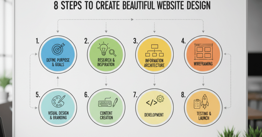
8 Steps to Create a Beautiful Website Design In the modern digital era, your website is often the first point of contact between your brand and a potential customer. Research suggests that it takes users only 0.05 seconds to form an opinion about your website, which determines whether they stay or leave.
Creating a “beautiful” website isn’t just about picking trendy colors; it’s about the harmonious blend of User Experience (UX), visual storytelling, and technical performance. Whether you are a business owner or a budding designer, following a structured process is the only way to ensure your digital presence is both stunning and functional.
Here are the 8 definitive steps to creating a beautiful, high-converting website design.
1. (8 Steps to Create a Beautiful Website Design) Define the Purpose and Strategy
Before you touch a single design tool, you must understand the “Why” behind your website. A beautiful design that doesn’t serve its purpose is a failure.
- Identify Your Goals: Are you selling products, building a portfolio, or capturing leads?
- Know Your Audience: A design for a high-end law firm will look vastly different from a design for a creative gaming studio.
- Establish Key Metrics: Determine what success looks like—is it a higher click-through rate (CTR) or longer time spent on a page?
2. Master the Information Architecture (Wireframing)
Think of a wireframe as the blueprint of a house. You wouldn’t pick out wallpaper before you’ve built the walls. Wireframing allows you to focus on hierarchy and flow without getting distracted by colors or images.
- Create a Sitemap: Map out the relationship between pages.
- Sketch Low-Fidelity Wireframes: Use tools like Figma or even a simple notepad to place your headers, buttons, and content blocks.
- Prioritize UX: Ensure that the most important information is “above the fold” (visible without scrolling).
3. Leverage Color Theory to Evoke Emotion
Colors aren’t just decorative; they are psychological triggers. A “beautiful” design uses a limited and purposeful color palette.
- The 60-30-10 Rule: Use a Primary Color (60%), a Secondary Color (30%), and an Accent Color (10%) for calls to action (CTAs).
- Contrast is King: Ensure your text is highly readable against the background. High contrast improves accessibility for users with visual impairments.
- Brand Consistency: Use colors that align with your existing brand identity to build trust.
4. Prioritize Typography and Readability
Typography is the voice of your website. If your font is hard to read, users will bounce, no matter how “pretty” the site looks.
- Limit Font Faces: Stick to two or three fonts max—one for headings and one for body text.
- Hierarchy Matters: Use different font weights (Bold, Semi-bold, Regular) and sizes to guide the reader’s eye from the headline to the sub-headline and then the body.
- Line Spacing (Leading): Give your text room to breathe. Proper line height prevents the “wall of text” effect that scares readers away.
5. Embrace Negative Space (Whitespace)
One of the biggest mistakes beginners make is trying to fill every pixel of the screen. Negative space (or whitespace) is the secret ingredient of professional, high-end design.
- Enhance Focus: Whitespace draws attention to your key elements, such as images or “Buy Now” buttons.
- Improve Scalability: A clean, spacious design translates much better to mobile screens than a cluttered one.
- Reduce Cognitive Load: By giving elements room, you make the site easier to navigate and digest.
6. Use High-Quality Imagery and Visual Assets
Low-resolution, “stocky-looking” photos can instantly ruin a professional design. To create a beautiful site, you need authentic and high-impact visuals.
- Custom Photography: Whenever possible, use real photos of your team, products, or office.
- Consistent Iconography: Ensure all your icons follow the same style (e.g., all “line art” or all “solid fill”).
- SVG Graphics: Use Scalable Vector Graphics (SVG) for logos and icons to ensure they stay crisp on high-resolution Retina displays.
7. Optimize for Mobile-First Responsiveness
In 2026, more than 60% of web traffic comes from mobile devices. A website is only beautiful if it works flawlessly on a 6-inch screen.
- Fluid Grids: Use a responsive grid system so elements resize proportionally.
- Touch-Friendly Design: Ensure buttons are large enough to be tapped easily by a thumb (usually at least 44×44 pixels).
- Loading Speed: Optimize your images to ensure the site loads in under 2.5 seconds, as mobile users are notoriously impatient.
8. Incorporate Subtle Micro-Interactions
What separates a “good” website from a “beautiful” one is the attention to detail. Micro-interactions are small animations that occur when a user performs an action.
- Hover States: Buttons that slightly change color or “lift” when a mouse hovers over them.
- Scroll Animations: Elements that gently fade in as the user scrolls down.
- Feedback Loops: A subtle “success” checkmark when a contact form is submitted.
- Caution: Don’t overdo it. Too much motion can be distracting and slow down your site’s performance.