
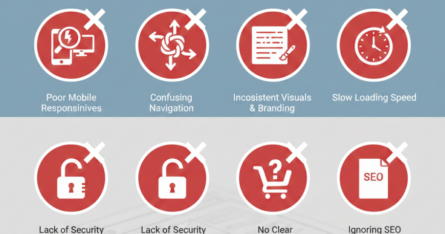
7 Common Mistakes to Avoid in Website Designing
7 Common Mistakes to Avoid in Website Designing. In the digital age, your website is your brand’s digital storefront. It is often the first and most critical touchpoint for potential customers. However, creating a high-converting, visually appealing website is more than just a creative exercise—it is a strategic one. Even the most beautiful designs can fail if they ignore the fundamental principles of User Experience (UX) and Search Engine Optimization (SEO).
Many businesses spend thousands on aesthetics but overlook functional details that drive growth. To ensure your digital presence is effective, here are 7 common mistakes to avoid in website designing and actionable steps to fix them.
1. Neglecting Mobile Responsiveness
In an era where over 50% of global web traffic comes from mobile devices, failing to design for small screens is the quickest way to lose visitors. A “desktop-only” mindset leads to distorted images, unreadable text, and broken buttons on smartphones.
- The Mistake: Designing a site that looks great on a 27-inch monitor but becomes a cluttered mess on an iPhone or Android device.
- The Consequence: Google uses Mobile-First Indexing, meaning a non-responsive site will rank significantly lower in search results, and mobile users will bounce almost immediately.
- The Fix: Adopt a Mobile-First Design approach. Start by designing for the smallest screen and scale up. Use flexible grid layouts and ensure all interactive elements are “thumb-friendly.”
2. Overcomplicating the Navigation
When users land on your site, they should know exactly where to go. If your navigation menu looks like a labyrinth, users will feel overwhelmed and leave. “Mystery meat navigation”—where users have to hover over icons to understand what they are—is a major conversion killer.
- The Mistake: Using non-standard labels (e.g., “The Journey” instead of “About Us”) or hiding the menu behind obscure icons.
- The Consequence: High frustration levels and a high Bounce Rate, as users cannot find the information they need within the first 5-10 seconds.
- The Fix: Stick to the Three-Click Rule: a user should be able to find any piece of information within three clicks. Use clear, descriptive labels and keep your primary menu limited to 5-7 essential items.
3. Slow Loading Speeds
In 2024 and beyond, speed is a core component of design. A beautiful website that takes 10 seconds to load is, for all intents and purposes, a broken website. Users expect a site to load in 2 seconds or less.
- The Mistake: Uploading high-resolution, uncompressed images or using too many heavy third-party scripts and animations.
- The Consequence: Decreased user satisfaction and a direct penalty from search engines. Every second of delay can result in a 7% reduction in conversions.
- The Fix: Use modern image formats like WebP, enable lazy loading for images below the fold, and minify your CSS and JavaScript files. Tools like Google PageSpeed Insights can help you identify specific bottlenecks.
4. Lack of a Clear Call to Action (CTA)
A website without a clear Call to Action is like a salesperson who gives a great presentation but forgets to ask for the order. Every page on your site should have a purpose, whether it is to get a user to sign up for a newsletter, download a guide, or make a purchase.
- The Mistake: Having no CTA at all, or worse, having too many competing CTAs that confuse the user (e.g., “Buy Now,” “Learn More,” “Call Us,” and “Subscribe” all on the same screen).
- The Consequence: The user experiences Choice Paralysis, leading them to take no action at all.
- The Fix: Use High-Contrast Colors for your primary CTA buttons to make them pop. Ensure the copy is action-oriented (e.g., “Get Started Today” instead of “Submit”).
5. Poor Typography and Readability
Typography is not just about choosing a “pretty” font; it is about communication. If your text is too small, the line spacing is too tight, or there is a lack of contrast between the text and the background, people won’t read your content.
- The Mistake: Using light gray text on a white background or employing “Display” fonts for long paragraphs of body text.
- The Consequence: Users will skim your site, miss your key value propositions, and leave because the experience is physically straining for their eyes.
- The Fix: Aim for a minimum body text size of 16px. Ensure a high color contrast ratio (following WCAG guidelines). Limit your font choices to two or three complementary typefaces to maintain a professional look.
6. Ignoring Accessibility (A11y)
Designing for the web means designing for everyone, including those with visual, auditory, or motor impairments. Ignoring accessibility is not only bad for business—it can also lead to legal complications in many jurisdictions.
- The Mistake: Using images that contain text without providing Alt Text, or relying solely on color to convey meaning (e.g., using only a red border to show an error in a form).
- The Consequence: You alienate a significant portion of the population (estimated at 15% globally) and lose out on potential revenue and SEO benefits.
- The Fix: Use descriptive Alt Text for all images, ensure your site is fully navigable via a keyboard, and use proper HTML Header tags (H1, H2, H3) so screen readers can interpret the structure of your content.
7. Overlooking Content Hierarchy
Many designers treat content as an afterthought, filling layouts with “Lorem Ipsum” and expecting the copy to fit later. This results in a “wall of text” that no one wants to read. Effective design must guide the eye through the content in order of importance.
- The Mistake: Giving every element on the page equal visual weight, or failing to use headers and bullet points to break up long sections.
- The Consequence: The user’s eye wanders aimlessly, and the most important information—like your Unique Selling Proposition (USP)—gets lost in the noise.
- The Fix: Use Visual Hierarchy techniques. Make your most important headlines the largest and boldest. Use white space (negative space) liberally to allow your content to “breathe” and to draw attention to key sections.
Summary Checklist for a Successful Website(7 Common Mistakes to Avoid in Website Designing)
To avoid these common pitfalls, run your next design through this quick checklist:
- Mobile Performance: Does the site function perfectly on a smartphone?
- Navigation: Can a new user find the “Contact” page in under 5 seconds?
- Speed: Does the homepage load in under 2 seconds?
- CTAs: Is there one clear, primary action for the user to take on every page?
- Legibility: Is the text easy to read without zooming in?
- Inclusivity: Is the site accessible to users with screen readers?
- Scannability: Are you using headers, bold text, and bullet points to make content easy to digest?
Conclusion
Website design is a balancing act between form and function. While it is tempting to focus purely on the visual “wow” factor, the most successful websites are those that prioritize the user’s needs and search engine requirements. By avoiding these seven common mistakes—ranging from poor mobile responsiveness to a lack of accessibility—you can create a digital experience that not only looks professional but also converts visitors into loyal customers.
Your website is a living project. Regularly audit your site for these errors to ensure you stay ahead of the competition and continue providing value to your audience.